


4.9
Try Risk-Free
for 60 days
AMP™
2500+ full-body workouts, real-time
feedback, activity & progress stats
to help you jump smarter.
AMP™
2500+ full-body workouts, real-time
feedback, activity & progress stats
to help you jump smarter.
INTRODUCING ON-DEMAND VIDEO CLASSES!
Sweat-inducing, calorie-burning workouts brought to you by the best jump rope trainers in the world.
GUIDED WORKOUTS. REAL RESULTS. DOWNLOAD TODAY!
GUIDED WORKOUTS. REAL RESULTS. DOWNLOAD TODAY!
INTRODUCING ON-DEMAND VIDEO CLASSES
Sweat-inducing, calorie-burning workouts brought to you by the best jump rope trainers in the world.
Burn More Calories per Hour
300  Walking
Walking 550  Swimming
Swimming 600  Jogging
Jogging 700  Cycling
Cycling 1,074  Crossrope
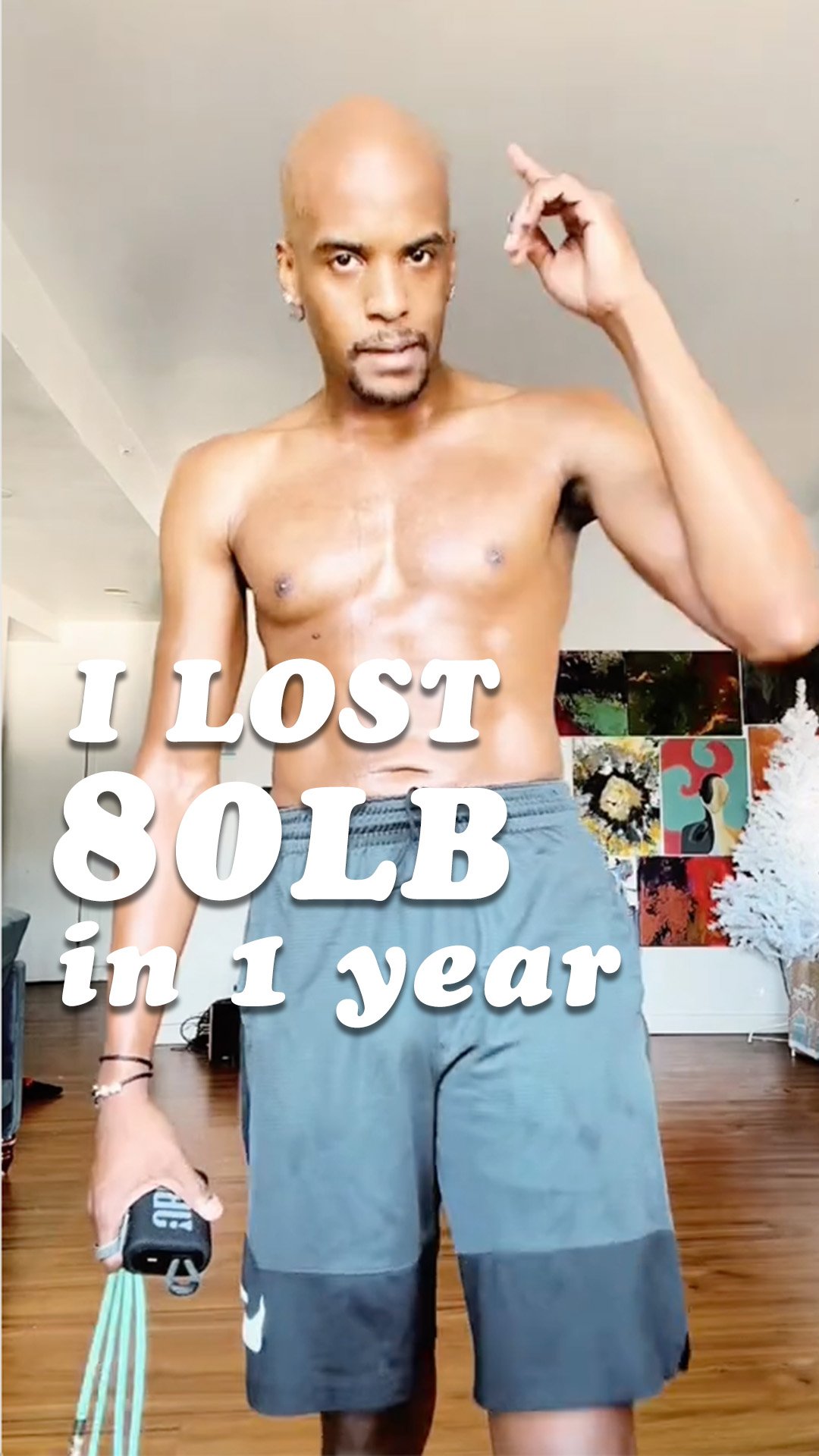
Crossrope Alec
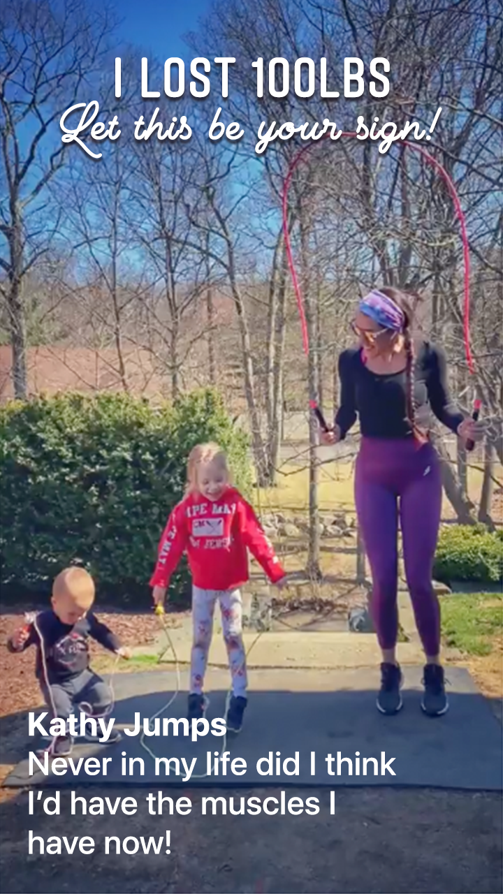
I was the heaviest I’d ever been and knew I needed to make a change. I got my ropes and the app and it was one jump at a time. I was able to build back my strength and lose the weight.
Cristi
Crossrope has not only brought me the ability to get physically healthy again after having a baby, but has connected me to a community that has made me feel empowered mentally.
Chad
I’m in better shape now than I was in my twenties or even as a teenager. I started using Crossrope about 6 years ago and the weight started flying off! I’ve seen phenomenal results!
Rima
I had gained 60 lbs and developed Type 2 Diabetes. I didn’t want to feel so drained. I slowly added in Crossrope and haven’t looked back. These are by far the best ropes I have ever used.
Jennika
I hit my top pregnancy weight... and I wasn’t pregnant It was then that I discovered I loved jumping rope. I am so grateful for Crossrope. They help change people’s lives for the better.
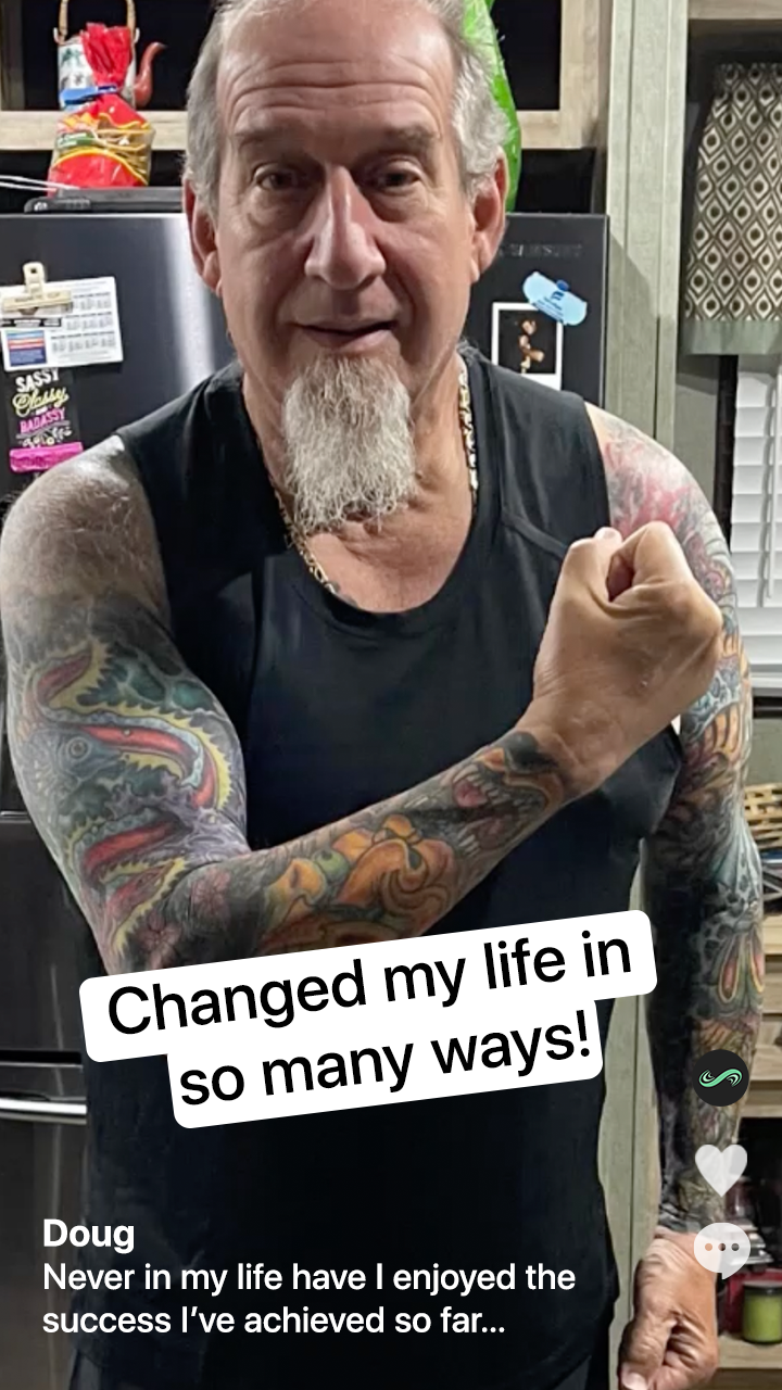
Doug
The quality and versatility of all of the products, combined with all of the support, has changed my life in so many ways.
Kristiane
I wasn’t comfortable in my own skin. Working out felt more like a punishment than a reward. Than Crossrope came into my life and changed everything. It was fun and I felt accomplished!
Tracy
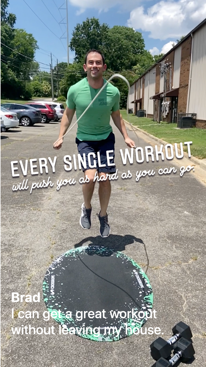
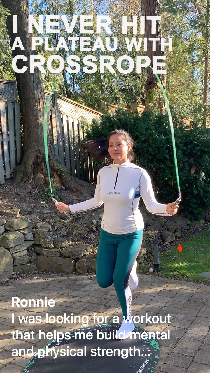
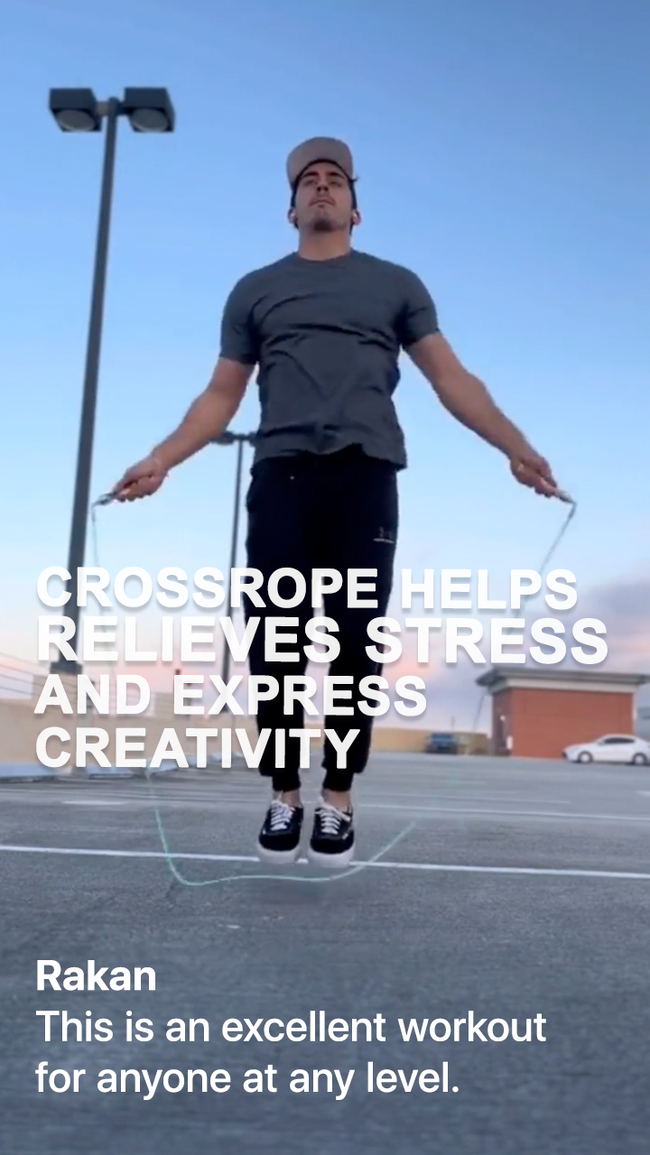
With AMP I am more consistent with my jumping. I’m in competition with myself and see in real time how I’m doing. I owe it all to AMP - I can’t recommend them enough!
Alec
I was the heaviest I’d ever been and knew I needed to make a change. I got my ropes and the app and it was one jump at a time. I was able to build back my strength and lose the weight.
Cristi
Crossrope has not only brought me the ability to get physically healthy again after having a baby, but has connected me to a community that has made me feel empowered mentally.
Chad
I’m in better shape now than I was in my twenties or even as a teenager. I started using Crossrope about 6 years ago and the weight started flying off! I’ve seen phenomenal results!
Rima
I had gained 60 lbs and developed Type 2 Diabetes. I didn’t want to feel so drained. I slowly added in Crossrope and haven’t looked back. These are by far the best ropes I have ever used.
Jennika
I hit my top pregnancy weight... and I wasn’t pregnant It was then that I discovered I loved jumping rope. I am so grateful for Crossrope. They help change people’s lives for the better.
Doug
The quality and versatility of all of the products, combined with all of the support, has changed my life in so many ways.
Kristiane
I wasn’t comfortable in my own skin. Working out felt more like a punishment than a reward. Than Crossrope came into my life and changed everything. It was fun and I felt accomplished!
Tracy
With AMP I am more consistent with my jumping. I’m in competition with myself and see in real time how I’m doing. I owe it all to AMP - I can’t recommend them enough!


NOT YOUR AVERAGE JUMP ROPE
NOT YOUR AVERAGE JUMP ROPE
Weighted jump ropes, in combination with the Crossrope App, engage and activate more muscle groups than other forms of cardio - helping you burn 20% more calories in less time.
Weighted jump ropes, in combination with the Crossrope App, engage and activate more muscle groups than other forms of cardio - helping you burn 20% more calories in less time.
PRECISELY ENGINEERED FOR A SMOOTH EXPERIENCE
PRECISELY ENGINEERED FOR A SMOOTH EXPERIENCE
Fast Clip Connection System
Crossrope handles use a small, robust connection system for quickly swapping between ropes.
Easy To Grip Handles
Ergonomic handles are comfortable and easy to grip - even with sweaty hands.
Next-Gen Tech
Lighting fast Bluetooth pairing with a battery that lasts up to 6 months per charge.


Love it or your money back.
Try for 60 days, risk-free. Send it back in any shape, for any reason.

Free US returns.
Receive free US return shipping and a full refund, no questions asked.
